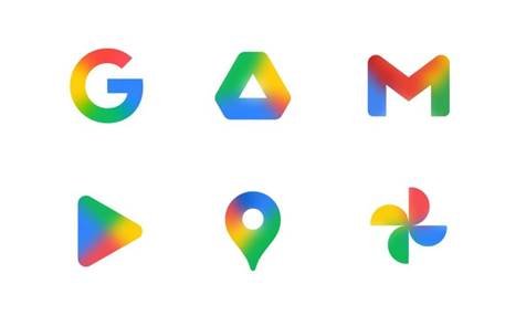
Google has retained the same logo design for decades. The last modifications were to smooth technological adaptations, what could it signify now?
“Google has done it yet again,” “The Google logo just became prettier!,” “Google’s iconic logo got a new makeover,” read some news headlines today.
This subtle transformation has opened the floodgates of appreciation for the tech giant. While a vital development across Google, it has raised enthusiastic eyebrows across the market.
It’s safe to say that this strategic move transcends any aesthetic relevance, at least for a big name like Google. Additionally, transforming its logo from solid colors to a more gradient and bright style goes far beyond the need for market validation.

So, what’s the missing piece?
The tech powerhouse hopes to balance being dramatic with their redesigns and appearing stagnant. Google has indeed been a special mention in conversations surrounding branding and design.
The organization has retained its minimalism and legacy style for over a decade. The only change in its logo was almost ten years ago, i.e., when the font was changed to the sans-serif style with the current circular ‘G.’
But this change has swept in the winds of speculation, with one user commenting, “Someone at Google found out the progressive blur.”
This is why even the tiniest change matters. For a brand name like Google, anything more would harm brand recognition and be perceived as rebranding. And anything less could prove to be no shift at all. It wouldn’t move the needle.
However, going from solid to gradient colors has brightened the stakes.
Google has ingrained itself across crucial tech conversations, but this carries a different connotation. This logo change is a first for the industry giant, and who would have expected it?
Google’s logo honors its beginnings and its past. This redesign could be an iteration of a more refreshing take on what they are and are supposed to be.

